Pillars
For our Interaction Design Studio course, my team designed a support system for formerly incarcerated individuals.
Course
SI 482: Interaction Design Studio
Project Timeline
We worked in a team of five to design this platform over the course of the fall 2019 semester.
Tools
- Figma
- Lucid chart
Skills
- Competitive Analysis
- Developing Personas
- Rapid Sketching
- Storyboarding
- User Flow Mapping
- Wireframing
- Paper Prototyping
- Digital Prototyping
The Prompt
Our class was based loosely on the CHI Student Design Challenge "Weaving the Threads within the Social Fabric", where students were asked to "consider the ways that technology might be used to strengthen our social fabric. Social fabric is a metaphor for how individuals interact with each other within a community."
The Problem
Formerly incarcerated people face a myriad of challenges that make it difficult for them to either rejoin or find a new community. A lack of support, barriers to resources like jobs and housing, and personal problems like mental health often lead to recidivism.
Our Solution
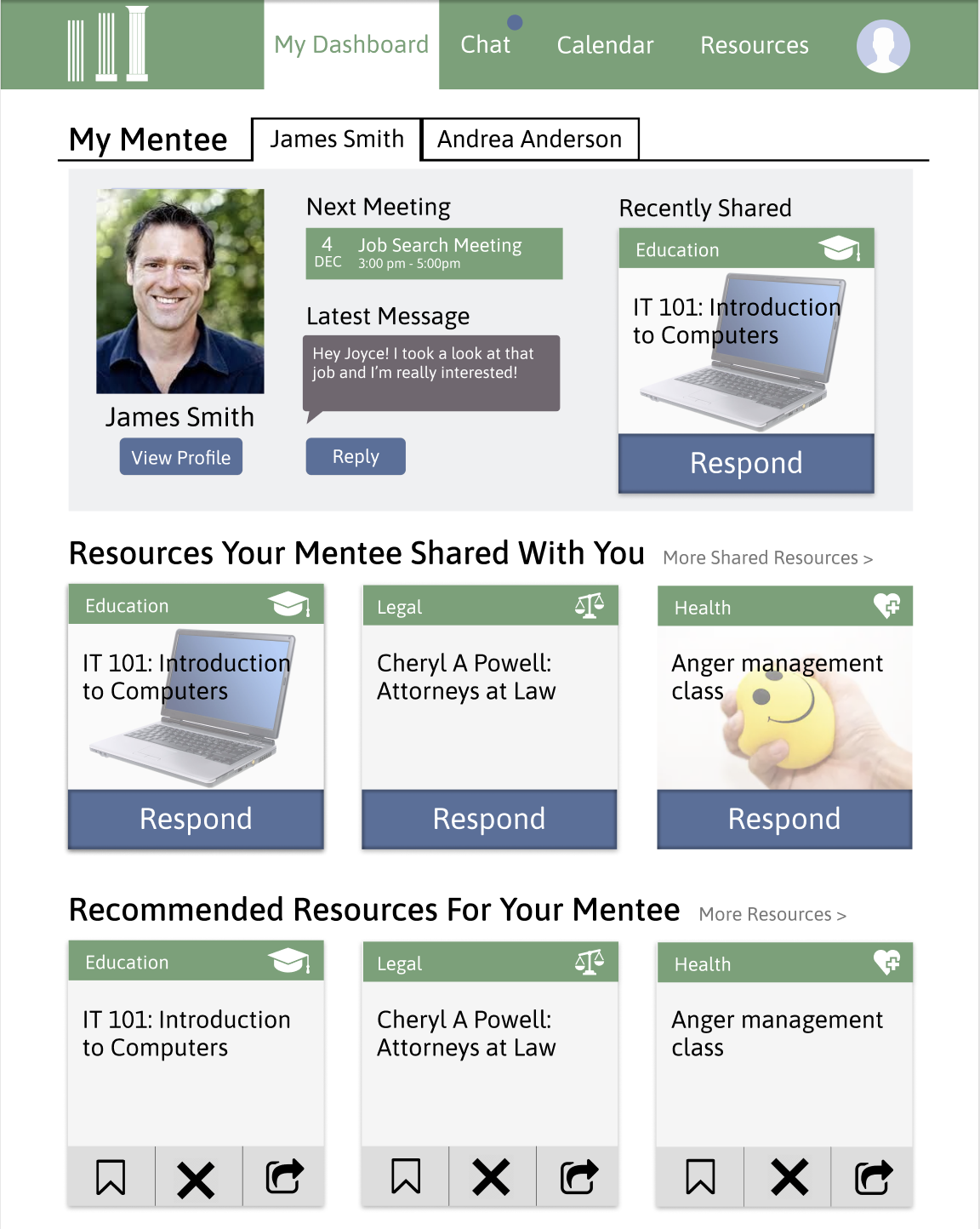
Our team designed an online platform to help bring together formerly incarcerated people through mentorship and resource sharing with the aim of reducing recidivism.
Designing for 2 User Groups
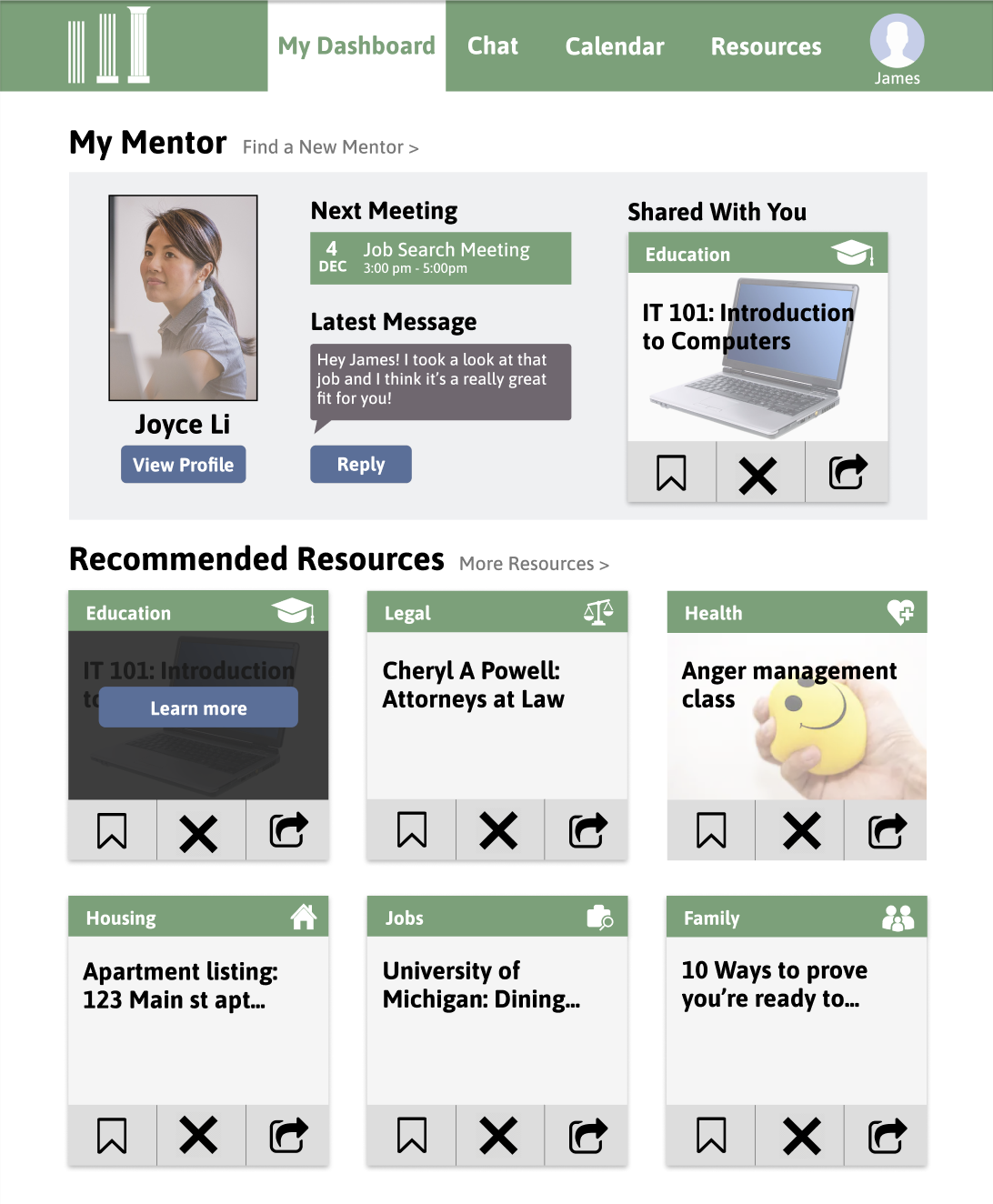
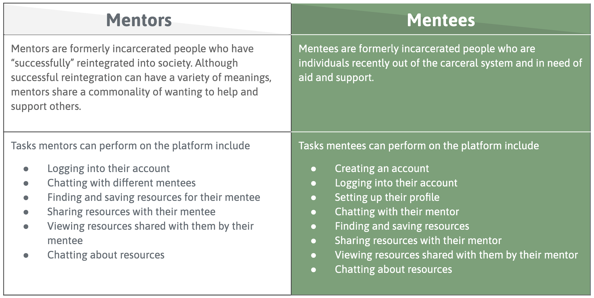
Our design has two distinct user groups: mentors and mentees. A big part of this design challenge was that we needed to consider what was relevant for each user group and how the two user groups would interact.
View our Digital Prototype Video
Below is a link to a video of our digital prototype, showcasing the main features that mentees and mentors would use. I specifically designed the chat pages, and I also linked the pages together to create the interactive prototype.
Dive Deeper into our Process!
Competitive Analysis
We began gathering research insights through a competitive analysis.
Due to the sensitive information being asked of our users, the wealth of information we were dealing with, and the fact that our users may not be technologically savvy, the five factors we placed particular emphasis on addressing in our design solution were:
- Ease of use/accessibility
- Trustworthiness
- Language level
- Quality of resources
- Searchability
Completing this competitive analysis helped our team understand what types of resources are currently available for formerly incarcerated people. It’s important to do competitive research early in the design process to make sure the new solution isn’t exactly the same as an existing solution. Existing solutions can also be helpful in informing what is working well and should be incorporated into our design, as well as what could be improved upon. We also learned from each other by dividing the work amongst the five of us; with each person analyzing one competitor in-depth, we were then able to come back together, share, and compare our findings.
Personas and Scenarios
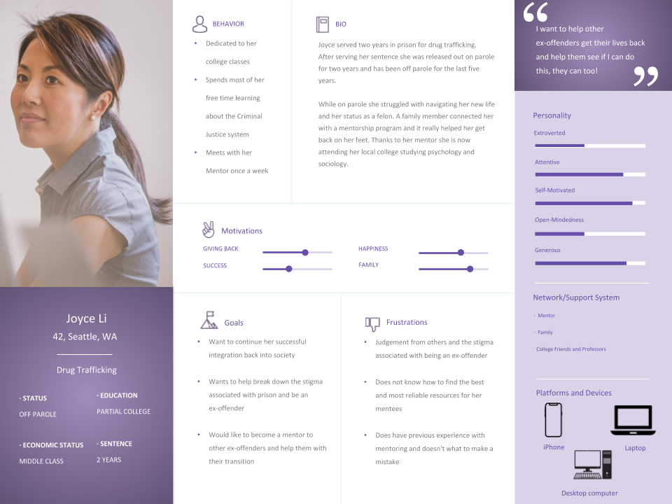
Based on our competitive analysis, we developed personas that helped us think about the design through our users' perspectives. We also found that writing scenarios was very helpful in giving us structure and foundation to refer back to while we brainstormed about the next steps in our design process. Also, creating a set of goals and tasks that our personas should be able to accomplish with our system gave us a good checklist of items that we should incorporate in our designs.
Rapid Sketching
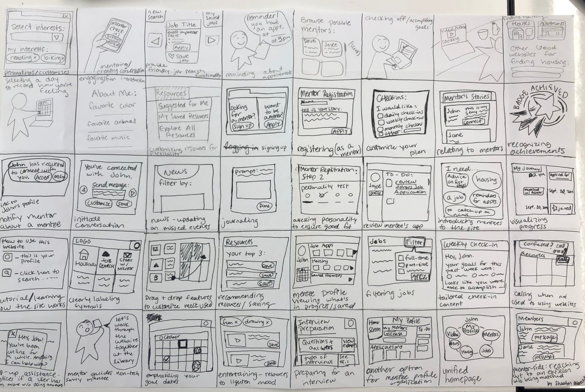
With our users prominent in our minds, we then did some rapid sketching. Each team member sketched 40 possible solutions, and the goal was for all 40 to be as unique as possible. The individual sketches could address the problem as a whole, or focus on a specific aspect of the solution.
Mine are shown below!
User Flow Mapping
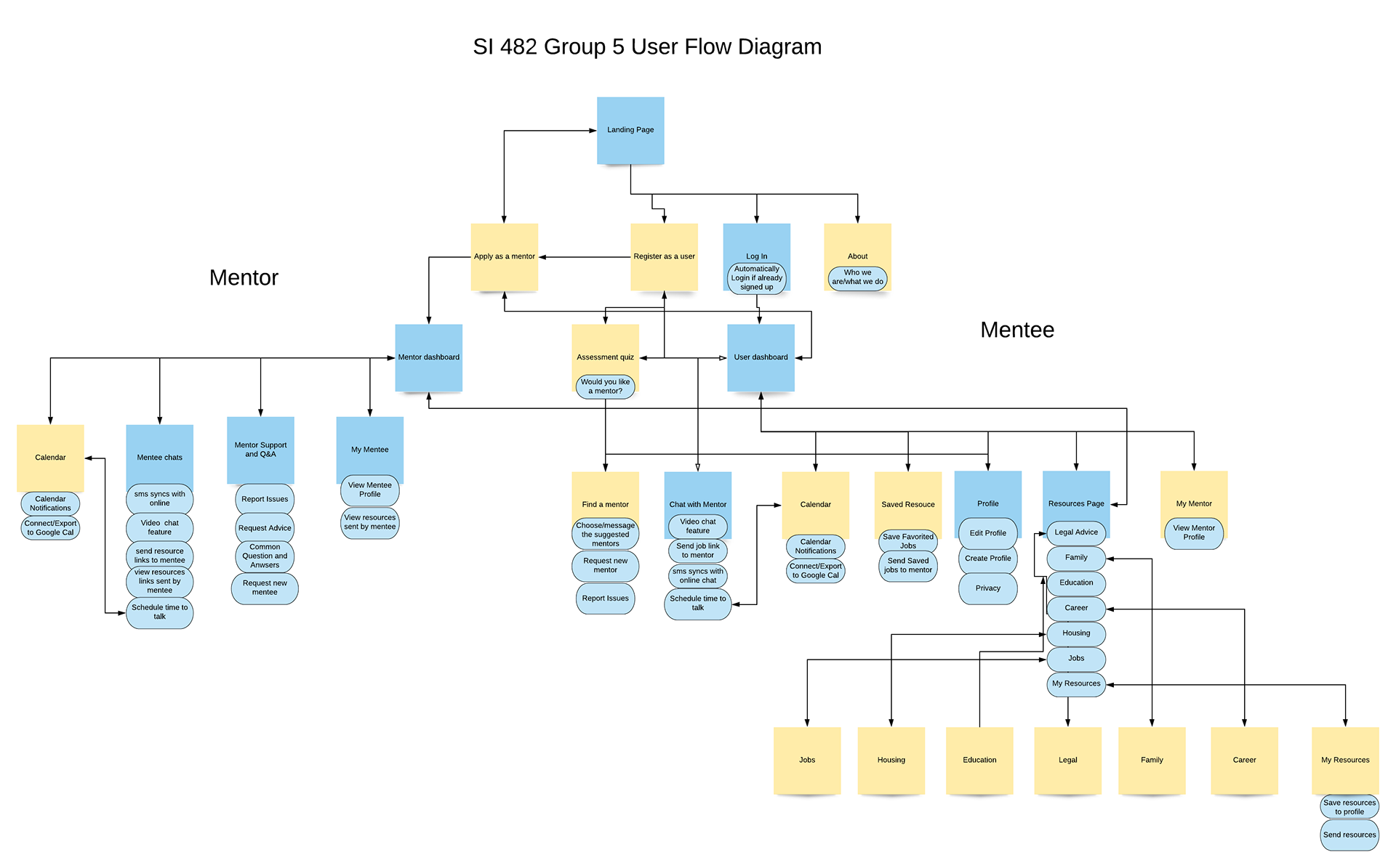
We decided to focus mainly on the mentor/mentee relationship aspect of the website because we were not able to find any websites that offer online mentorship for formerly incarcerated individuals. We envisioned a lot of opportunities for personalization/customization of the resources recommended to the mentees, but ultimately we did not flesh out the customization process because of our limited timeframe. The blue sticky notes in the diagram below are the features that we did focus on.
Paper Prototyping
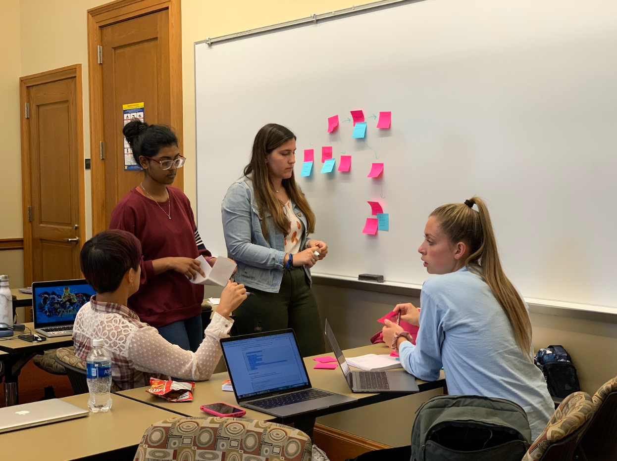
After defining our user flow, we created a paper prototype focusing on the mentorship aspect of the platform. During class, we hallway tested our prototype with other students that we could find throughout the building.
Digital Prototyping
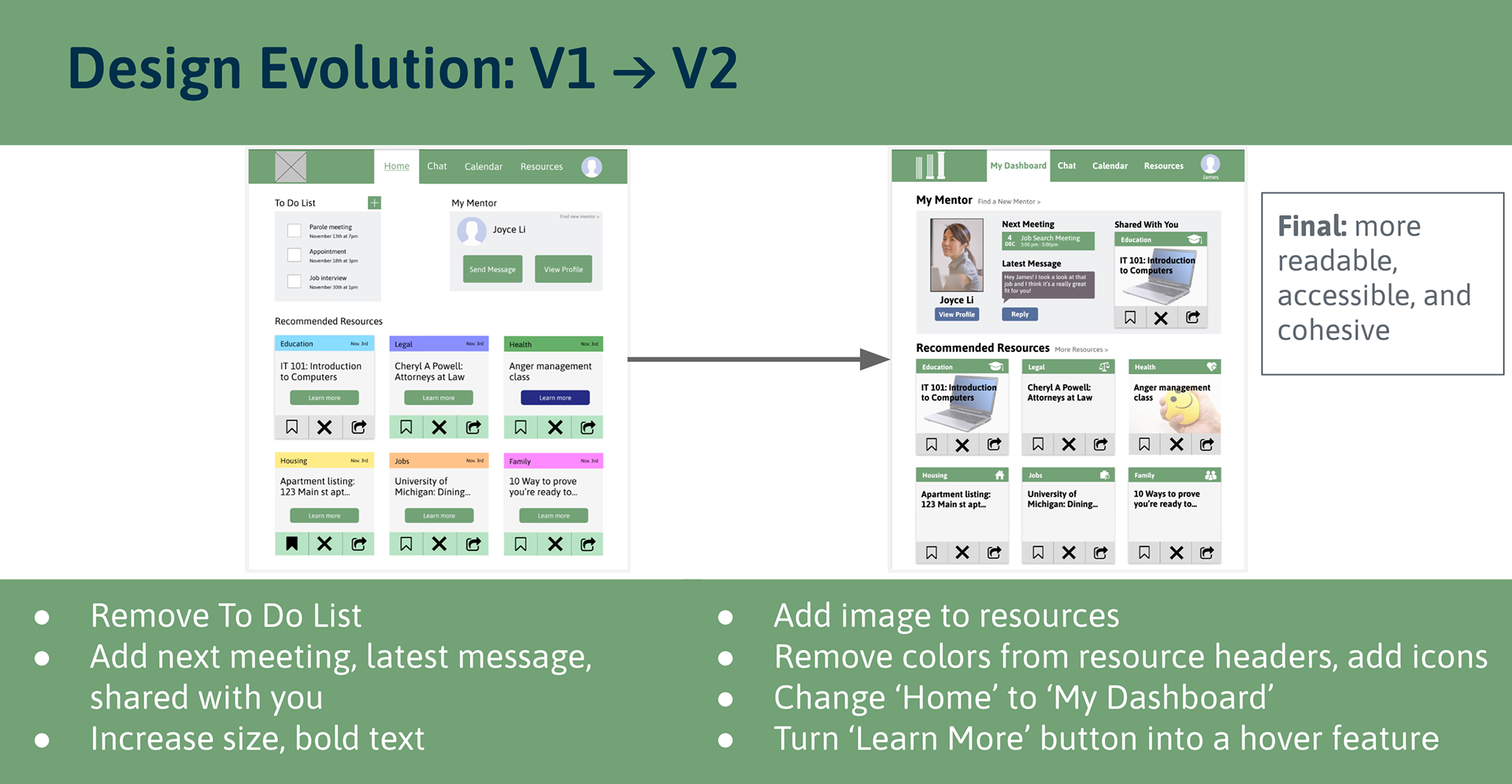
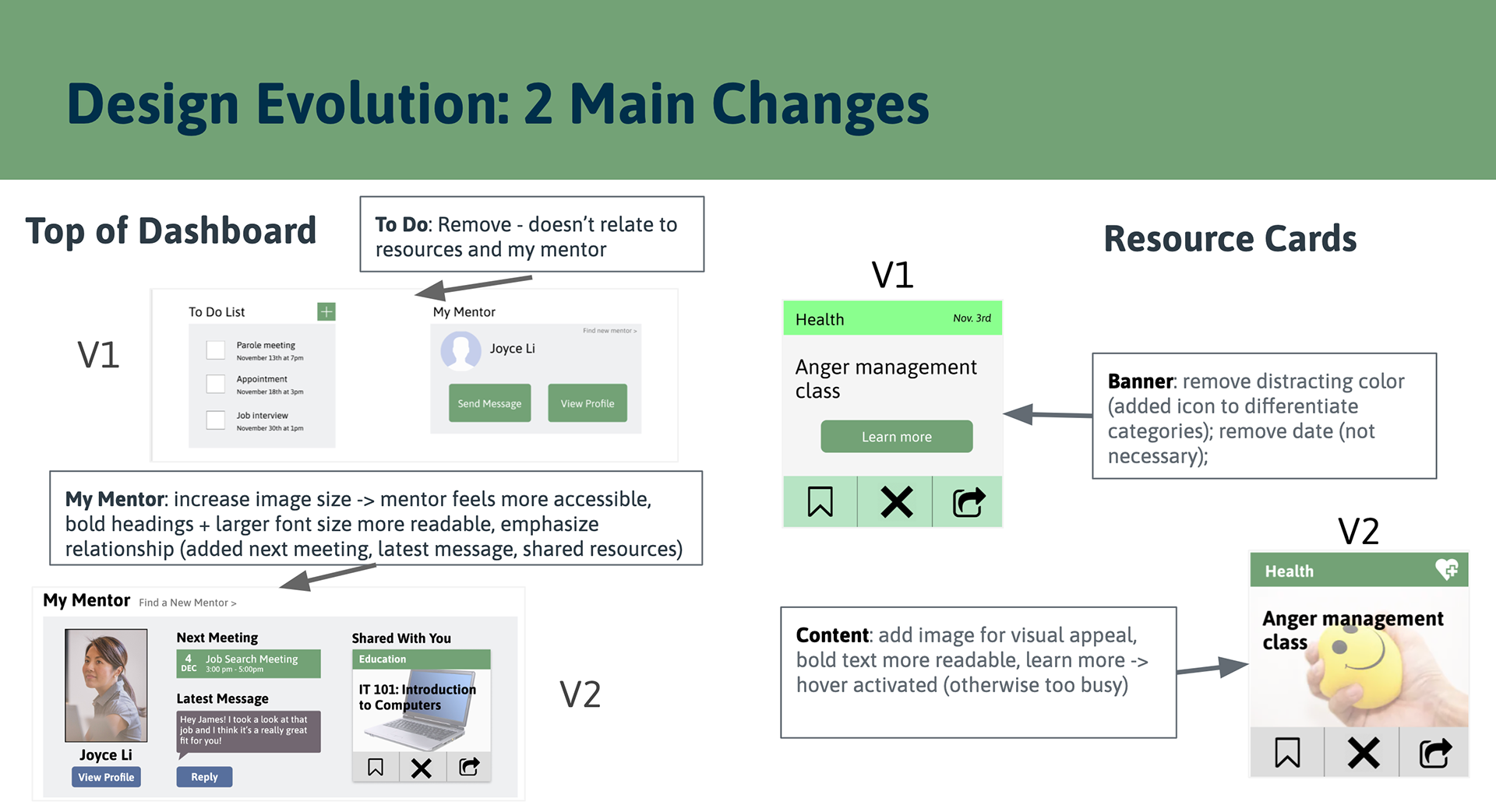
After transferring our paper prototype into a digital version on Figma, we conducted usability tests, and then we modified our design to reflect the feedback.
Reflection and Future Steps
Because this course was centered around the interaction design process specifically, there was not much time allotted for user research. Especially with our particular user population, this made it difficult to gather any feedback from formerly incarcerated individuals.
Luckily, the class gave us many opportunities to iterate on our design and receive feedback from both our instructors and other students in our lab. Additionally, we were able to conduct user tests and both the paper and digital prototyping phases.
However, our team wanted to acknowledge that we did not gather feedback from our actual user population. I believe that design decisions should always be informed by user needs, so this is one area where my heart doesn't sit well with our process. However, our professor encouraged us to continue with this project post-completion of the course, so we reached out to a professor and a PhD student in the School of Information whose research is focused around formerly incarcerated individuals. We hope to delve into more research next semester, connect with our user base, and take more steps towards making our platform a reality!