Interaction Maps
I created interaction maps to help the Academic Innovation software tool team visualize the flow of possible interactions within their websites, ViewPoint and GradeCraft.
Project Timelines
ViewPoint: 3 weeks. Throughout July of 2019, the ViewPoint maps were one of several projects that I worked on while working full-time as a User Experience Research Fellow at the University of Michigan Center for Academic Innovation.
GradeCraft: 8 weeks. During fall of 2019, the GradeCraft maps were one of several projects that I worked on throughout the semester while working part-time (approximately 9 hours/week) as a User Experience Research Fellow at the University of Michigan Center for Academic Innovation.
Tools
- Adobe XD
Skills
- User Flow Diagramming
- Interaction Mapping
- Visual Design
Background
As a User Experience Research Fellow at the University of Michigan's Center for Academic Innovation, some of my main projects have been creating interaction maps for two of the Center's software tools, ViewPoint and GradeCraft.
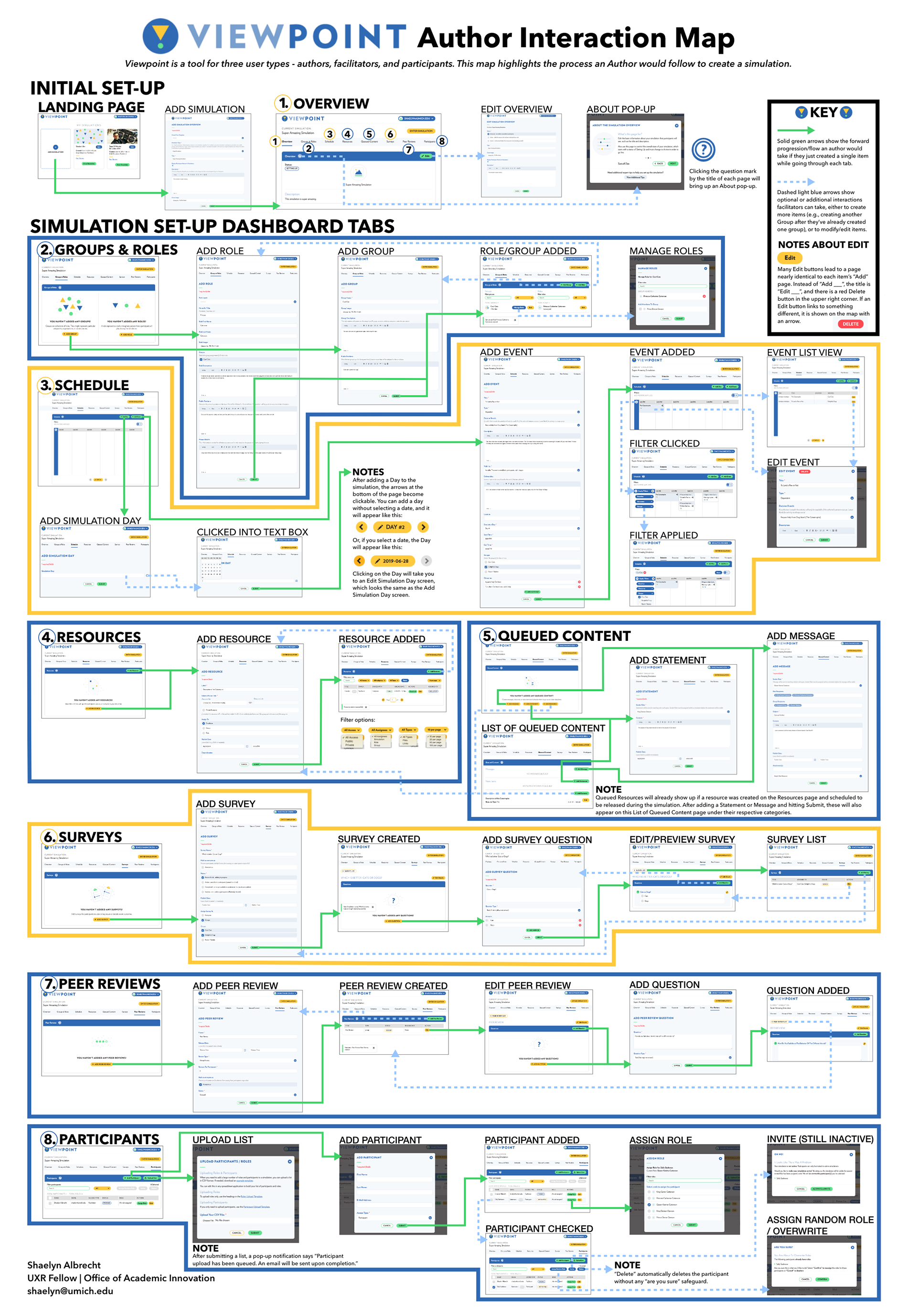
ViewPoint is a website designed for creating and running role-based simulations. Simulations allow students to take on perspectives that may differ from their own and to immerse themselves in scenarios. An important aspect of ViewPoint's functionality is the actual creation, or "authoring" of the simulation. There are three user groups: participants, facilitators, and authors.
GradeCraft is a learning management system that helps instructors build gameful courses. It encourages students to focus on the craft of learning. The platform is extensive and very customizable. There are two main user groups: instructors and students.
The Goal
The Software Tools Team was looking for a way to visualize the complex sets of possible interactions within some of their websites. They were looking for something that could help verbalize where there may be any issues in that flow.
The Solution
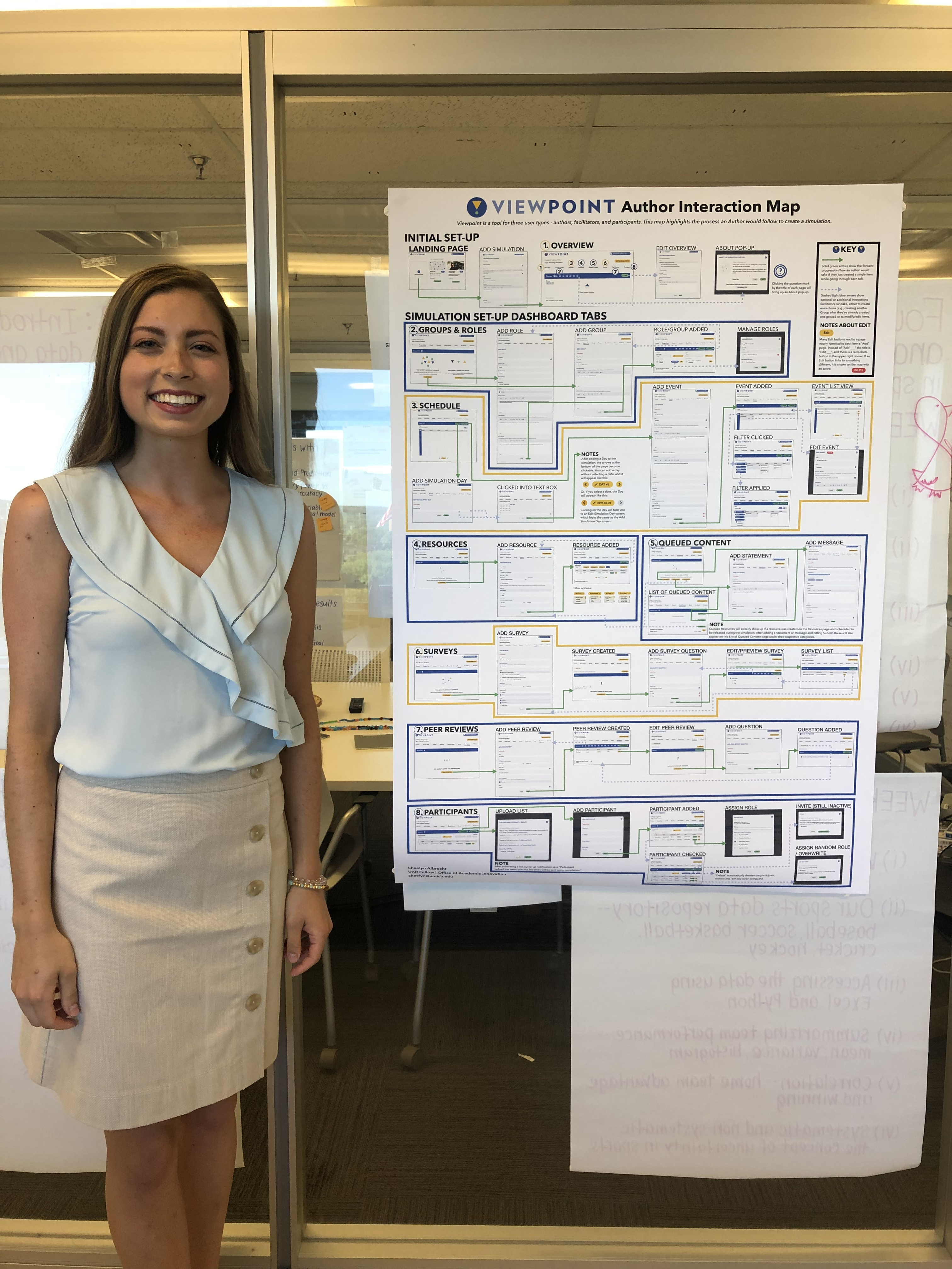
The Associate Director of Research & Development reached out to me about creating an interaction map for ViewPoint. My task was to thoroughly explore the website and design a map that would clearly communicate the user flows.
My Process
To put it simply, this project involved two things:
- Taking a LOT of screenshots
- Having conversations with members of the software team to understand what would best suit their needs.
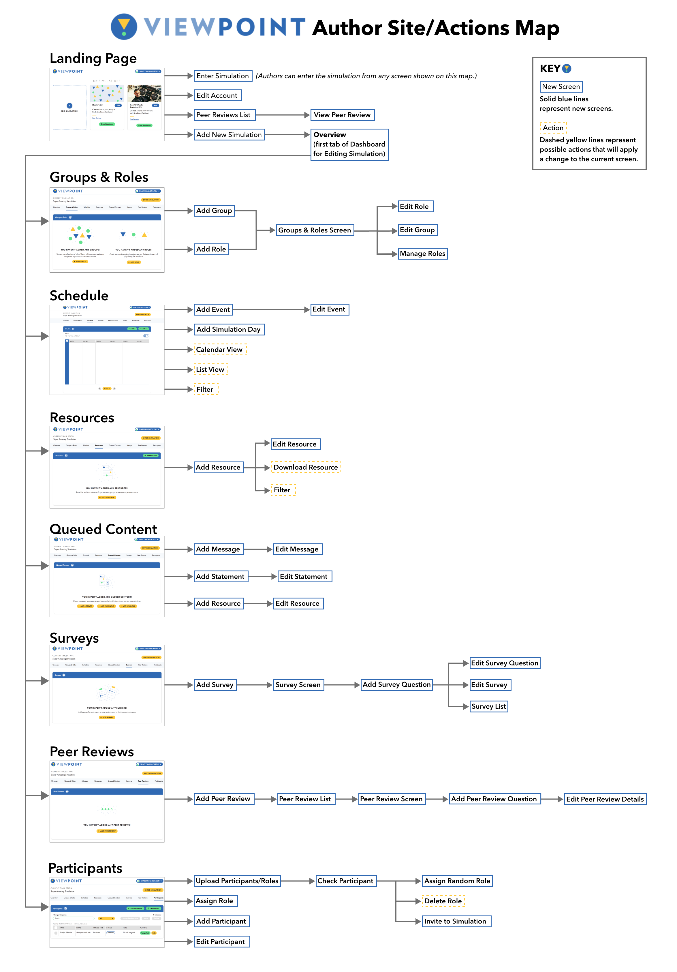
ViewPoint
Interaction Map? Site Map? User Flow Diagram?
In the UX world, there are a lot of different names for the many research and design methodologies we use, and sometimes what's referred to at one place as an "interaction map" may be called a user flow diagram somewhere else. To expand on this, it's also safe to guess that one person's interpretation of an "interaction map" will differ from someone else's interpretation. Because of this, I knew it was important to find out what specific information the software team was hoping to gain from this map.
Throughout my design process, I shared the map (in its various stages) with members of the software team, and I continually reached out to gather insight and understand what the UX designers, developers, and the software portfolio manager envisioned getting out of the map.
One of the UX designers suggested creating a version that was, in her words, more of an information architecture-style map, where you just see the names of pages rather than screenshots. I explored this type of map as well, and I found it helpful to more easily see how you get from one page to the next without getting into the details of the individual pages.
Most of the team members I spoke to were looking for a visual tool that would help identify usability issues.
To create the map, I went through the process of designing my own simulation using the ViewPoint website. Along the way, I took screenshots to capture every step of the process. Though this was an intricate process, I became incredibly acquainted with the tool!
Along the way, I completed a heuristic review of ViewPoint. Following Nielsen’s ten heuristics, my fellow UXR intern and I provided recommendations regarding the flow/usability of specific features that we wouldn’t have noticed without images of the actual screens. For example, we suggested adding confirmation/warning messages when deleting roles, groups, students, or anything else.
Impact
The ViewPoint map was well received by the team; it was printed as a poster, hung on the conference room wall, and it is still on display. Digital versions have been used to help onboard new team members to ViewPoint.
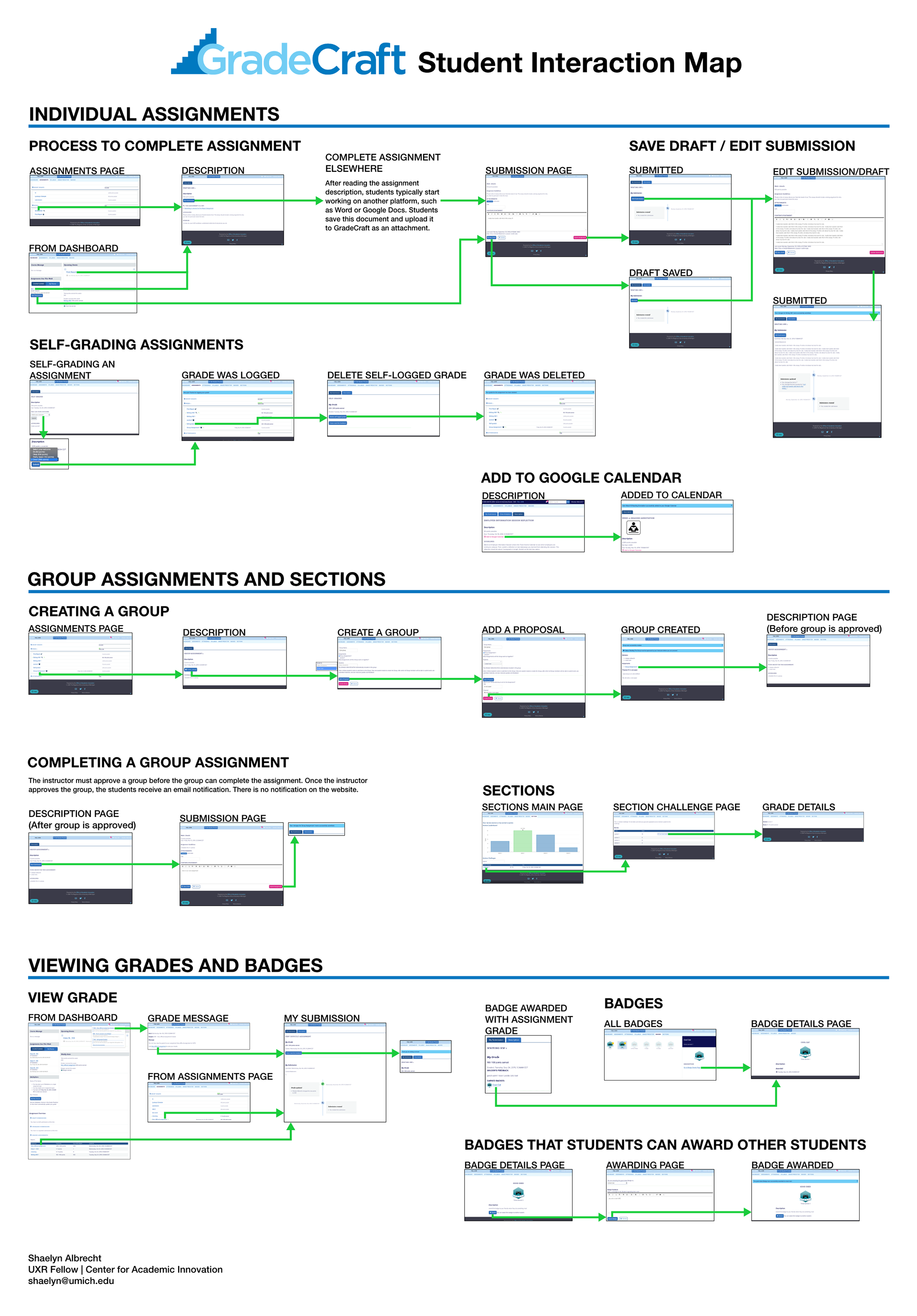
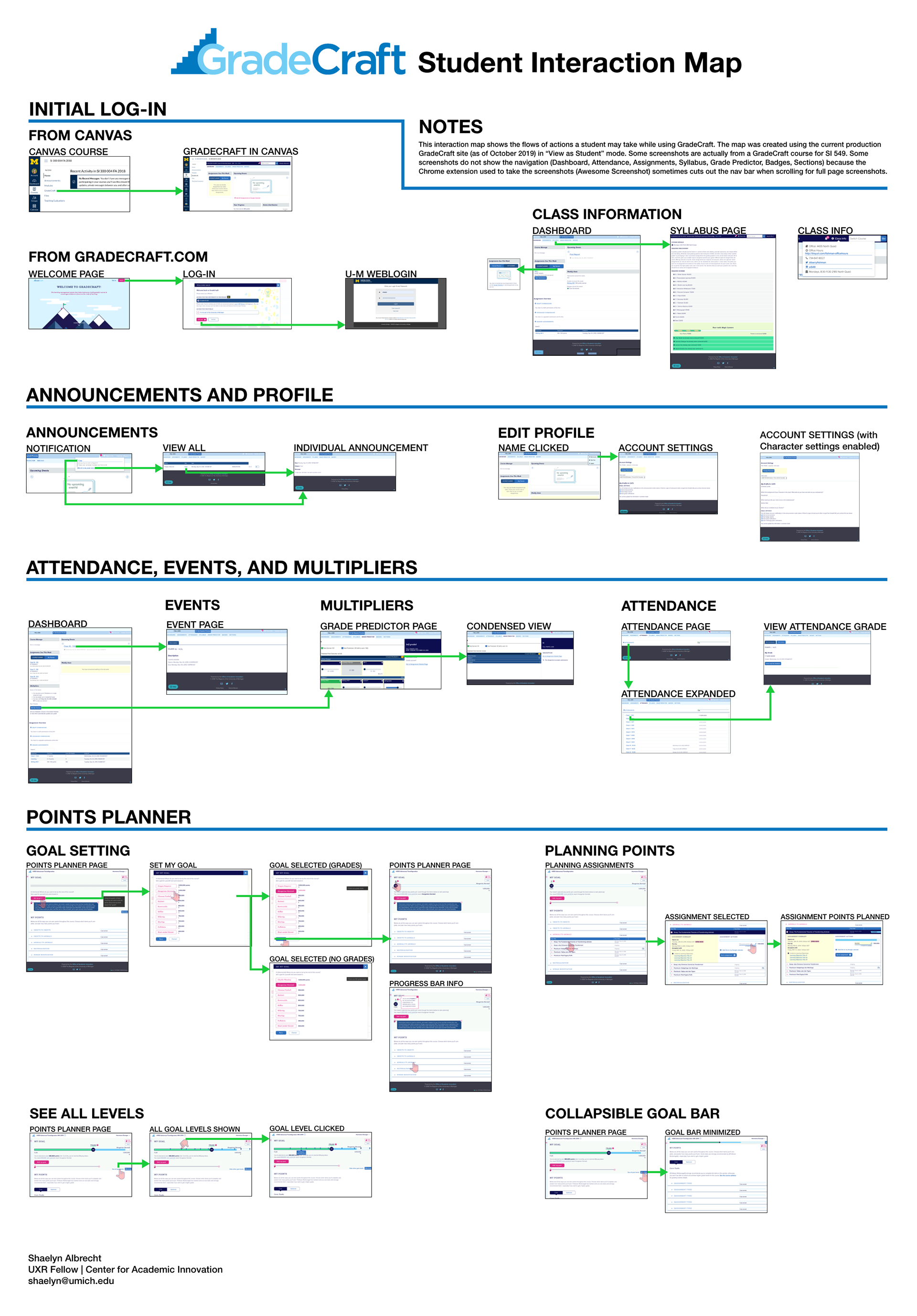
GradeCraft
The GradeCraft team was going to be having a Retreat in early November to discuss the next year's plans for the tool. After the success of the ViewPoint map, the Associate Director was interested in having maps created for GradeCraft as well; she was hoping to have maps that visualized the student experience of using GradeCraft.
When I began designing the map for GradeCraft, it was instantly clear that there was an overwhelming amount of information on the website. This was also expressed in conversations I had with my supervisor and members of the GradeCraft team. I met with several team members to better understand how the map was going to be used before ultimately coming to the decision that the map would be more helpful if it was actually two maps.
I also chatted with another intern who happened to be taking a course that used GradeCraft. It was helpful to hear her perspective on the tool and find out how she interacted with the tool most frequently.
Taking this feedback into account, I followed a similar process to how I created the ViewPoint map: grouping similar interactions together and labeling each set of interactions.
Impact
The two completed maps were used during the GradeCraft Retreat to help the team talk about specific features and have quick visual references to what they were talking about. The maps served as the foundation for conversations about student workflows, and they also helped bring awareness to the expansive functionality that GradeCraft provides.